My Role
User Research
User interviews
UX Designer
Information Architecture
Prototyping
Usability testing
Background
The scheduling tool is embedded within an internal support hub—a centralized platform where team members go to access technology assistance. This tool allows users to book appointments directly with IT engineers for one-on-one technical support, serving as a critical touchpoint in ensuring timely help and minimizing downtime across the organization.
Research
Previous experience showcases how users would make an appointment. Team members would fill out and select x amount of information to create an appointment. A few questions came up when doing a usability testing with this current version, are these questions necessary for the client to know? Is it necessary for the engineer? What if the client doesnt know "x" selection?
1

Interviews

Findings
The original scheduling tool included a vertically scrolling form that required team members to answer numerous, detailed questions. While the intent was to provide engineers with upfront context, the design created a poor experience for users requesting support.
Through user interviews and a usability audit, we discovered that the current experience was misaligned with team members' needs—especially during moments of frustration when they sought technical help. The form asked for detailed technical information that many users didn’t know or found difficult to provide, creating a barrier to receiving timely support.
We recognized that users came from diverse backgrounds: departments, age groups, and levels of technical familiarity. Expecting them to complete a lengthy, tech jargon-heavy form created unnecessary friction. To validate this, we asked participants to walk through the existing process and gathered feedback, confirming that the form was overwhelming, unclear, and not user-friendly.
We also identified key information engineers actually needed—such as device type, affected applications, and a brief issue description—and focused on streamlining the intake process to capture only what was essential.
1
Ideation & Prototyping

After several collaborative sessions with users, engineers, and stakeholders, we refined our approach and began prototyping. Our goal was to reduce friction and cognitive load during appointment scheduling.
We minimized the number of required input fields by identifying what engineers truly needed: name, phone number, and a brief issue description. This drastically simplified the process for users—especially those who may already be overwhelmed.
To support a smoother experience, we introduced a visual calendar component to make time selection intuitive and accessible. We also added smart UI cues, such as enabling the “Next” button only after all required fields on a page were completed. This reduced the chance of incomplete submissions and kept users focused, even during potential distractions.
Finally, we integrated Zoom and Outlook calendar confirmations and reminders to ensure users had clear follow-up and meeting details, reducing no-shows and confusion.
Usability testing


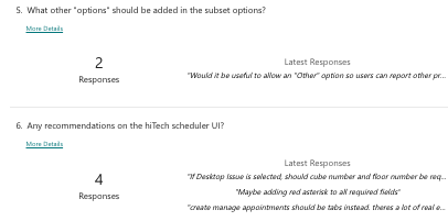
We conducted moderated usability testing via Zoom, where participants completed key appointment scheduling tasks while we observed their behaviors, interactions, and completion times. We tracked the number of clicks, time-on-task, and noted areas where users hesitated or expressed confusion.
At the end of each session, participants completed a feedback questionnaire, providing both quantitative and qualitative insights into their experience.
Our participant pool was intentionally diverse. It included engineers from our team, engineers outside the team, administrative staff, and professionals from various departments. This variety ensured we captured a broad range of perspectives and technical proficiencies, helping us design an experience that was intuitive and inclusive for all users.
Takeaways
Takeaways from the project after we made those changes in dev environment from our first scheduler to our prototype, it really benefited and decrease the amount of time it took to create an appointment. It made it very usable and easy to understand what they're filling in. The new tool has a wide range of features including, scheduling, outlook and zoom integration, and reminders.
In summary this new tool has helped team members streamline the process in creating appointments, it will streamline engineers process in taking notes for each appointments. The overall goal has been met, getting team members the help they need in a timely manner and getting them back up and running, overall helping the company maintain its standard as a leading retailer.
Target
Scheduler app
Tools
Timeline
Audience
Figma
Maze
FigJam
Slack
Zoom
Internal HQ, DC, and Store Lead Team Members
10 Weeks
The goal was to address the usability and site navigation we found. Proposing solutions which included redesigning the user interface, reorganizing the information architecture (navigation and flow) to complete an input or task and incorporating calendar and zoom integration.
2

Results


2
3


4
